What’s a hot and useful technique in network #dataviz?

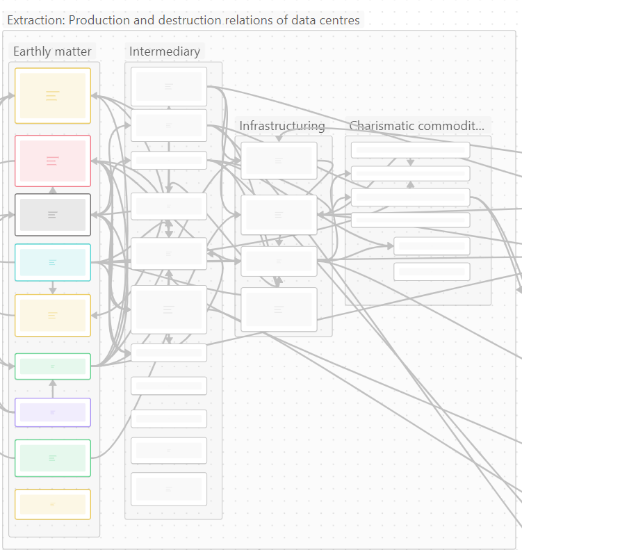
I am fiddling around with a graph that represents extractive practices around a #datacenter. Work in progress in #Obsidian. #sts

Going minimal? Staying with the trouble of dots and lines, but with style? Or: layers, an infographic, …?

A network graph. Moving from the left to the right: earthly matter (e.g., sand, energy, clearing land), intermediary (like pouring concrete), infrastructuring (e.g., build a damn DC), and charismatic commodities (think servers). The main categories on the left are the most important and thus in colour